Granularity in Load Test Results and Chart Display
When it comes to load testing, interpreting the results accurately is as vital as setting up the test correctly. One factor that plays a crucial role in understanding load test results is 'granularity'. But what exactly is granularity, and why is it so significant?
Understanding Granularity
In the simplest terms, granularity refers to the level of detail in the data. Imagine taking a photograph: a high-resolution photo (high granularity) lets you zoom in and see minute details, whereas a low-resolution one (low granularity) might be a bit blurry when zoomed in. Similarly, in load test results, granularity relates to the level of detail in which test results are captured and displayed.
The Impact on Charts
When we translate the concept of granularity to charts representing load test results, it dictates how data points are displayed:
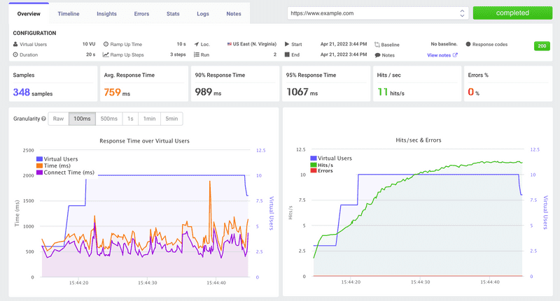
High Granularity (Fine Detail): If the granularity is high, you get a detailed view. This is like the Raw tab you can click on. Each request received during the test is represented individually. It's as close to the 'real-time' data as you can get.
Low Granularity (Averaged Detail): On the other hand, if you're viewing averaged values, the data points on the charts are consolidated. So, instead of seeing each individual request, you might see average values over intervals like 100ms, 500ms, 1 second, 1 minute, or 5 minutes. This offers a more general view, useful for spotting overall trends or patterns over the test's duration.
Why Does Granularity Matter?
You might wonder why we need both detailed and averaged views. Here's why granularity is crucial:
Spotting Anomalies: With high granularity (like the Raw view), you can identify specific instances of anomalies. If a single request took an unusually long time, you'd spot it here.
Viewing Trends: Lower granularity, where results are averaged, helps in understanding general performance trends. It's easier to see how the system performed over time without the 'noise' of every single data point.
Performance Insights: Depending on what you're looking for, different levels of granularity can provide varied insights. For instance, the average values over 1 minute might show consistent spikes, indicating periodic issues.
Optimizing Display: Let's be honest; sometimes, too much data can be overwhelming. If you're trying to get a quick overview or present results to stakeholders, an averaged view (like values consolidated every 1 minute) can be more digestible.
Making the Choice
So, how do you decide which level of granularity to use? It's all about what you aim to achieve:
If you're deep-diving into performance issues or trying to pinpoint exact moments of failure, go for the Raw tab. Embrace the detail!
For general analysis, trend spotting, or sharing results with a broader audience, the averaged views, whether it's every 100ms or 5 minutes, might serve you better.
In conclusion, granularity is all about balancing detail with digestibility. By understanding and adjusting granularity in your load test results, you ensure that the insights you gain are both accurate and actionable. So, the next time you're staring at a load test chart, remember to choose the level of detail that's just right for your needs!
