Timeline View
Understanding the Timeline View
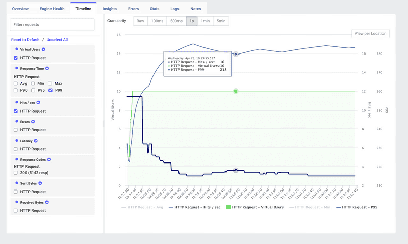
The Timeline tab in LoadFocus gives you a unified, time-series perspective on your load test. It overlays key metrics—virtual users, throughput, and response times—so you can see exactly how your system behaves as load ramps up, plateaus, and ramps down.
Key Components
- Virtual Users (green line) Number of active JMeter threads executing your test plan at each moment.
- Hits/sec (throughput) (blue line) Aggregate requests per second sent by all engines.
- Response Time Metrics Choose from Avg, Min, Max, P90, P95, P99, and more to plot latency trends.
- Granularity Selector Switch between Raw, 100 ms, 500 ms, 1 s, 1 min, and 5 min aggregation intervals.
- Filter Panel Toggle each sampler, metric type (Hits/sec, Errors, Latency), or response code series on or off.
- View per Location Break out the timeline by geographic region or cloud provider for multi-location tests.
How to Use the Timeline Tab
- Run Your Test
Execute your JMeter
.jmxon LoadFocus as usual. - Open “Timeline” Click the Timeline tab in the results toolbar.
- Select Metrics Use the left-hand filter panel to check/uncheck Virtual Users, Hits/sec, Response Time percentiles, Errors, etc.
- Adjust Granularity Choose a time bucket that matches your troubleshooting needs—1 s for spikes, 1 min for overall trends.
- Zoom & Pan Drag across the chart or click View per Location to focus on specific time ranges or locations.
- Hover for Details Hover over any data point to see exact values. For example: HTTP Request – Hits/sec: 16 HTTP Request – Virtual Users: 10 HTTP Request – P99: 218
Interpreting Timeline Trends
- Load Ramp-Up Watch how Hits/sec scales with Virtual Users during the ramp-up phase. A plateau in throughput before target users are reached may indicate a bottleneck.
- Steady-State Behavior During the flat portion of the user curve, latency and throughput fluctuations reveal system stability under constant load.
- Ramp-Down Observations As virtual users decrease, throughput and latency should drop smoothly. Persistent high latencies during ramp-down suggest lingering resource contention or slow releases.
- Anomaly Detection Use the Granularity and Filters to spot sudden drops in throughput or spikes in P99 latency that may not appear in aggregate stats.
Best Practices
- Baseline and Ramp Profiles Configure a controlled ramp-up/ramp-down profile in JMeter (e.g., constant load vs. step load) to produce predictable timeline shapes.
- Correlate with Other Views If you see an unexpected plateau or spike, switch to Engine Health, Insights, or Errors to drill into resource usage or failure rates at that timestamp.
- Sampler-Level Analysis Use the sampler dropdown to overlay multiple request types (e.g., Login, Search, Checkout) and compare their individual throughput and latency patterns.
- Location Comparison In geo-distributed tests, toggle View per Location to identify regional performance differences caused by network latency or regional capacity limits.
Conclusion
The Timeline view in LoadFocus is your dynamic control panel for visualizing how virtual user load, request throughput, and response times evolve during a JMeter test. By leveraging filters, granularity options, and per-location breakdowns, you can quickly identify performance thresholds, anomalies, and stability issues—then correlate them with other dashboards for a complete diagnosis.
