Intuitive Dashboards in Load Testing: The Overlooked Advantage
Usability is now the deciding factor in load testing adoption. Technical depth alone no longer sets a platform apart. Teams gravitate toward intuitive dashboards – not because they look nice, but because they make performance data accessible and actionable. If your load testing tool buries insights in dense tables or outdated charts, don’t be surprised when testing falls by the wayside.
Why Usability Drives Load Testing Adoption
Historically, load testing tools competed on protocol support and scripting flexibility. Today, as organizations scale their performance testing, the real challenge is clarity. Modern teams are cross-functional by necessity: developers, QA engineers, and site reliability leads all need to quickly spot bottlenecks, share findings, and act. If a dashboard isn’t instantly readable, collaboration slows and issues slip through the cracks.
Is Your Infrastructure Ready for Global Traffic Spikes?
Unexpected load surges can disrupt your services. With LoadFocus’s cutting-edge Load Testing solutions, simulate real-world traffic from multiple global locations in a single test. Our advanced engine dynamically upscales and downscales virtual users in real time, delivering comprehensive reports that empower you to identify and resolve performance bottlenecks before they affect your users.
Feedback from the field is clear – teams often abandon load testing platforms not for lack of features, but because interpreting results is too cumbersome. As cloud-native and browser-based solutions become standard, the expectation for intuitive dashboards only grows. No one wants to wrestle with a confusing UI when release cycles are tighter than ever.
Key Insight: Teams consistently choose intuitive dashboards over technical depth alone, because shared understanding and speed matter more than theoretical flexibility.
The Contrarian Prediction: Usability Outpaces Protocol Coverage
Conventional wisdom says protocol support is king. But as performance testing becomes integral to CI/CD, instant answers matter more than raw data. AI-driven analytics and real-time visualizations now turn test results into actionable insights in seconds. Teams under pressure to deliver stable releases need dashboards that surface what matters, not just everything measured.
Some platforms now focus on real-time performance insights, streamlining complex data into accessible dashboards. This change goes beyond appearance – it enables fast, confident decisions, something verbose logs and spreadsheet exports can’t deliver.
Think your website can handle a traffic spike?
Fair enough, but why leave it to chance? Uncover your website’s true limits with LoadFocus’s cloud-based Load Testing for Web Apps, Websites, and APIs. Avoid the risk of costly downtimes and missed opportunities—find out before your users do!
Dashboards as the Linchpin for Collaboration and Speed
Intuitive dashboards are the linchpin for shared understanding and decisive action. As organizations push for faster releases and broader team participation, tools that obscure rather than clarify will fall behind. The future belongs to platforms that make complex performance data instantly accessible and meaningful to every stakeholder.
The Evolution of Load Testing: From Data Overload to Actionable Insight
For years, load testing meant cryptic reports, overwhelming spreadsheets, and dashboards designed for tool creators – not the teams maintaining application health. Legacy platforms bombarded users with raw data: endless CSV exports, waterfall charts with hundreds of metrics, and stacks of server logs. The intent was thoroughness, but the result was workflow bottlenecks and skipped tests.
Common pain points included engineers wading through indecipherable graphs to find a single latency spike, QA teams skipping tests because reporting took longer than running them, and managers left with more questions than answers. For many, the sheer volume and complexity of load testing outputs meant performance checks happened late – or not at all.
The emergence of intuitive dashboards in load testing platforms changed this dynamic. The focus shifted from “capture every metric” to “surface the right metrics at the right time.” Modern teams need clear, actionable insights that translate directly into decisions about code, infrastructure, and user experience.
LoadFocus is an all-in-one Cloud Testing Platform for Websites and APIs for Load Testing, Apache JMeter Load Testing, Page Speed Monitoring and API Monitoring!
When dashboards are confusing or overloaded, tests don’t get run, or worse, critical issues slip into production. The industry recognized that raw data is not enough – interpretation is everything.
Cloud Platforms and CI/CD Integration
The rise of cloud-based and browser-first load testing solutions has changed the equation. These platforms eliminate on-premise infrastructure and offer true scalability – run a test across several global regions in minutes. This change goes beyond performance; it enables continuous, integrated workflows.
Usability is now a front-line concern because load testing is part of the CI/CD pipeline. Tests are triggered with every build, and results are reviewed before code ships. If dashboards aren’t intuitive, critical insights get lost and bottlenecks persist. Teams expect real-time performance insights surfaced directly in the tools they already use, whether through a browser dashboard or integration with observability platforms.
Consider a typical agile team: a developer checks in code, the CI/CD pipeline spins up cloud-based load tests, and by the time the build review starts, a concise, visual summary of performance is available. No one has to parse hundreds of raw logs. The team sees spikes, regressions, and failing endpoints at a glance. Intuitive dashboards make performance everyone’s responsibility, not just something for ops to handle after hours.
There is a learning curve – setting up new cloud platforms or configuring integrations can be tricky, especially in complex environments. But the long-term payoff is clear: faster feedback cycles, fewer missed issues, and a culture of shared accountability for performance. As web and API complexity grows, the ability to turn data into insight quickly will only become more essential.
How Intuitive Dashboards Supercharge Team Collaboration
Intuitive dashboards have become the backbone of high-functioning load testing teams. When QA engineers, developers, and site reliability engineers all interpret performance data, clarity is a prerequisite for shared understanding and fast action. In cloud-based platforms, dashboards aren’t just pretty interfaces – they’re the single source of truth for distributed teams.
For teams juggling releases across time zones, a single source of truth is non-negotiable. Complex legacy dashboards often force teams to clarify results over chat just to interpret a performance spike. Modern dashboards use visual cues like color-coded alerts, trend lines, and contextual tooltips to strip away ambiguity. The result? Less time spent debating what the data means, and more time spent addressing what matters – performance bottlenecks that impact users.
Key Insight: When dashboards translate raw metrics into clear visual language, cross-functional teams spot issues faster and collaborate with far fewer missteps.
Before/After: Team Handoff With and Without Intuitive Visualization
| Before: Complex Legacy Dashboard | After: Intuitive Dashboard |
|---|---|
|
|
Why does the “after” scenario work? Visual cues and real-time collaboration features cut through the fog of raw data. Instead of chasing context, teams zero in on the underlying issue. With intuitive dashboards, every stakeholder speaks the same language – colors, labels, and summaries that don’t require deep performance engineering expertise to decode.
It’s not just about speed. A unified dashboard helps teams align on performance goals and share accountability. QA can see exactly which endpoints failed, developers can pinpoint slow queries, and SREs can correlate errors with deployment times – all from a single pane of glass. The friction of handoffs and the risk of misinterpretation shrink dramatically.
Even with the best dashboards, initial setup or integration can take some upfront effort, especially when mapping custom metrics or configuring CI/CD hooks. But that investment pays off every time you avoid a production fire drill or a week of finger-pointing after a missed SLA. The real impact of intuitive dashboards isn’t just prettier charts – it’s a team that moves together, not in circles.
Speed to Decision: From Raw Data to Actionable Insights
The Shrinking Window: Why Dashboards Matter
Intuitive dashboards in load testing platforms draw a clear line between teams that react to issues and teams that preempt them. When running tests in a cloud environment across global regions, the volume of metrics can be overwhelming. Platforms with real-time dashboards surface anomalies, bottlenecks, and slowdowns as they happen.
The impact is immediate: teams can identify a memory leak during a spike test and flag it for the next sprint, or spot an API endpoint degrading under load before customers notice. The window between test execution and remediation shrinks, supporting the agile principle that speed to insight is as important as the test itself.
AI-Driven Analytics: Separating Signal from Noise
With continuous integration now the norm, modern load testing tools have moved beyond static graphs. AI-powered insights sift through large volumes of datapoints to highlight the handful that matter. Some platforms’ analytics engines flag latency spikes or error rate anomalies the moment they emerge, often correlating them with recent code changes or environmental factors. This means you spend less time hunting for problems and more time fixing them.
Here’s how specific dashboard features accelerate the journey from raw data to action:
| Dashboard Feature | Sample Use Case |
|---|---|
| Real-Time Bottleneck Visualization | Spotting a database write lock during a peak traffic simulation |
| AI-Generated Anomaly Alerts | Immediate notification of a sudden latency spike on a payment API |
| Comparative Trend Analysis | Reviewing response time trends across consecutive builds |
| Capacity Planning Recommendations | Projecting infrastructure needs based on simulated peak loads |
Key Insight: The right dashboard can cut hours off the feedback cycle, turning performance data into actionable fixes before they impact users.
Release Velocity and Production Stability
The ripple effect of faster insights is clear: release cycles speed up, and production incidents decrease. Teams using platforms with intuitive dashboards – especially those with AI recommendations – report fewer rollbacks and a smoother path from staging to production. When every stakeholder can interpret test results without a data science background, performance testing becomes a shared, ongoing responsibility instead of a last-minute hurdle.
No dashboard erases the need for a thoughtful testing strategy. Some organizations will still face a learning curve, especially if they’re migrating from legacy tools or integrating with complex CI/CD setups. But over time, the clarity provided by intuitive dashboards changes team culture: performance becomes a visible, manageable part of daily development, not an afterthought.
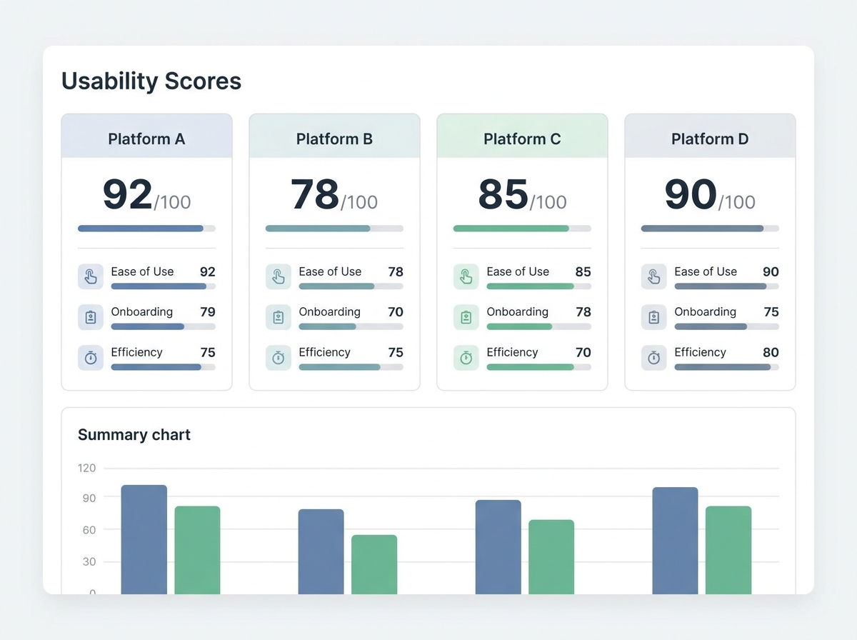
Intuitive Dashboards in Load Testing: Feature Comparison
How Top Platforms Stack Up on Usability and Reporting
Intuitive dashboards have become non-negotiable for effective load testing. The best dashboards do more than visualize metrics – they clarify, prioritize, and prompt teams toward action. Yet not all platforms get this right. Some treat dashboards as an afterthought, piling on widgets and graphs without considering how teams make decisions under pressure.
Three criteria matter most for intuitive dashboards in load testing platforms:
- Dashboard usability: How quickly can someone new to the tool spot a bottleneck or regression?
- Protocol support: Does the tool cover real-world scenarios – HTTP(S), WebSockets, gRPC, databases?
- CI/CD integration and reporting: Can results be baked into existing pipelines, and do reports tell a clear story?
Visual Comparison Table: Usability, Protocols, and CI/CD Support
| Platform | Dashboard Usability | Supported Protocols | CI/CD Integration | Reporting Features |
|---|---|---|---|---|
| LoadFocus | High | HTTP(S), WebSockets, REST APIs | Native integrations with CI/CD tools | Real-time metrics, trend analysis, export options, API access |
| JMeter | Moderate | HTTP(S), FTP, JDBC, JMS, TCP, WebSockets (plugins) | CLI support, plugin-based CI; no native dashboards in core | Raw logs, HTML dashboards (manual setup), external plugins |
| BlazeMeter | High | HTTP(S), WebSockets, SOAP, JDBC, MQTT | CI plugins for Jenkins, Bamboo, Azure DevOps | Live streaming, collaborative dashboards, SLA tracking, export options |
| k6 Cloud | High | HTTP(S), WebSockets, gRPC | Native support for CircleCI, GitHub Actions, GitLab, Jenkins | Interactive dashboards, trend analysis, threshold alerts |
| Gatling Cloud | Moderate | HTTP(S), WebSockets, JMS, MQTT | Integrations with Jenkins, Bamboo, TeamCity | Live dashboards, scenario comparison, exportable reports |
| Artillery Cloud | Moderate | HTTP(S), WebSockets, Socket.io, MQTT | CLI and API for most CI/CD systems | Interactive reports, trend analysis, team-sharing links |
Who Prioritizes Dashboard Design?
Cloud-based offerings like LoadFocus, BlazeMeter, and k6 Cloud have put dashboard usability front and center. LoadFocus makes it easy to switch from high-level charts to granular request traces – critical when a test triggers a spike in error rates. BlazeMeter’s dashboards support cross-team collaboration with simultaneous access and real-time updates. k6 Cloud emphasizes actionable trend lines and threshold tracking to reduce noise.
By contrast, open-source tools such as JMeter and Gatling often require additional setup or plugins to match the clarity of commercial options. JMeter’s built-in dashboards lag behind in both aesthetics and real-time filtering. Gatling and Artillery offer more visual polish in their cloud versions, but power users may still prefer to export raw data and build custom visualizations elsewhere.
Where Even the Best Dashboards Can Fall Short
No matter how intuitive a dashboard, some challenges remain. Some platforms require upfront configuration – especially for non-HTTP protocols or custom scripting. For example, JMeter’s flexibility comes with a steeper learning curve and a risk of cluttered dashboards when running complex distributed tests.
Another common issue is the gap between visualization and action. Even with AI-driven insights, dashboards can’t replace domain expertise. If your team hasn’t defined clear performance goals or SLAs, the best dashboard won’t help interpret ambiguous results. Most tools excel at point-in-time snapshots but may struggle with tracking trends across months or correlating results with external observability platforms. Integrations exist, but stitching together these views takes deliberate setup and ongoing maintenance.
Ultimately, intuitive dashboards in load testing aren’t just window dressing – they’re a necessity for teams that need to act fast and with confidence. The best platforms prioritize design, but it’s up to you to ensure dashboards are connected to meaningful engineering and business outcomes.
Breaking Down the Core Elements of Intuitive Dashboards
Intuitive dashboards in load testing separate tools that teams genuinely adopt from those that gather dust. It isn’t about throwing more metrics on the screen – it’s about clarifying complexity so developers, QA leads, and SREs can act fast, especially when performance is on the line. What sets truly intuitive dashboards apart? A handful of core elements, each rooted in SaaS UX best practices and tailored for the realities of load testing.
- Real-time updates: Effective dashboards stream results as soon as they’re available. This immediacy allows teams to spot bottlenecks as they emerge.
- Customizable views: Whether you’re a novice scanning top-level metrics or an expert drilling into thread counts, the ability to tailor dashboards to your workflow makes a tangible difference. Some platforms let users create custom panels for API response times, error rates, and resource consumption.
- Instant filtering and drill-downs: The best dashboards give you speed-to-clarity. Find the spike in errors, click to see which endpoints are failing, and break it down by region or device – all without leaving the dashboard.
- Error heatmaps and trend visualizations: Visual cues like color-coded heatmaps surface anomalies in a sea of data. Seeing a cluster of red cells on a latency map makes it obvious where to focus your attention.
- Exportability: Options to export charts, raw data, or reports directly to CSV or PDF allow teams to share findings with stakeholders or integrate results into incident retrospectives.
Supporting Both Novice and Expert Users
Designing a dashboard for a load testing platform means walking a fine line: provide enough power for seasoned testers without overwhelming newcomers. Novice users benefit from default views that highlight key metrics – think “average response time” or “error rate by endpoint” surfaced front and center. Advanced users expect granular controls, such as custom threshold alerts or the ability to overlay multiple test runs for comparison.
This balance is what makes various tools viable for varied teams. Open-source options often win with flexibility, but commercial dashboards tend to outpace them on polish and ease of onboarding. Regardless of tool, the goal remains the same: ensure every team member can answer the essential question – “Is our system ready for real-world traffic?” – in just a few clicks.
The Role of Visual Hierarchy in Reducing Cognitive Load
Smart dashboard design isn’t just about which metrics to show – it’s about how you show them. Visual hierarchy is crucial. By prioritizing placement, font size, and color, the dashboard guides users’ eyes straight to the most critical performance issues.
Layout matters: Grouping error rates, response times, and throughput in a logical sequence means users spend less time scanning and more time acting. Color coding – like using red for critical errors and green for passing thresholds – reduces the mental load of interpreting results. In practice, a well-designed heatmap makes it instantly clear if a specific region or endpoint is underperforming.
Prioritization is another key: Not every metric needs equal billing. By surfacing high-impact anomalies, the dashboard nudges users to address the biggest problems first. This approach borrows from SaaS best practices, where the goal is to minimize clicks and cognitive friction.
Even the most intuitive dashboards require some initial setup – configuring test scripts, choosing which metrics to track, and aligning on alert thresholds. However, the investment pays off quickly. When a dashboard is built with these principles, it becomes a shared command center for performance, enabling teams to keep applications fast, reliable, and ready for growth.
Transforming Performance Testing Culture: From Siloed Reports to Shared Dashboards
Dashboards as Collaboration Catalysts
Legacy load testing often left critical performance data trapped in spreadsheets or dense PDF exports. If you’ve ever tried tracking down the cause of a slow checkout page by scanning through endless columns of raw numbers, you know the pain. The result? Insights stayed siloed within QA or ops, while developers and business leaders remained in the dark until a crisis forced a review.
Intuitive dashboards in modern load testing platforms are breaking this pattern. Real-time, visually accessible metrics now pull developers, SREs, and even non-technical stakeholders into the conversation. Performance test results move out of email attachments and into shared dashboards that anyone can interpret, regardless of their technical background.
Executive Buy-In and Site Reliability
When performance health is front-and-center on an intuitive dashboard, site reliability stops being an afterthought. Executives and product owners can watch live trends and see, in plain language or clear visualizations, where bottlenecks are forming. This kind of continuous visibility doesn’t just help with incident response – it builds organizational trust in load testing as an ongoing safety net, not an ad hoc emergency measure.
Real-world experience shows that when leaders see a tangible, color-coded dip in response times during a campaign, they’re far more likely to prioritize infrastructure upgrades or capacity planning. The dashboard becomes a conversation starter, not just a technical report.
Before/After: Incident Response in Practice
| Before: Siloed Reports | After: Intuitive Dashboards |
|---|---|
| Incident triage starts with a frantic Slack thread: “Anyone have the latest load test results?” QA emails a spreadsheet, but the ops team can’t decipher the column names. Developers await instructions, while leadership is left guessing about impact. | Incident triage begins with everyone looking at the same live dashboard: The spike in error rates is flagged in real time. The team drills down on endpoint latency, identifies the failing service, and assigns action items – while execs watch progress unfold. |
Why does the “after” version work? Because shared dashboards collapse time and remove friction. Instead of piecing together context from different teams, everyone sees the same facts – usually within seconds, not hours. This immediate alignment means incident response is faster, but also more accurate and less stressful.
Some intuitive dashboards require an initial investment in setup and training, especially if your team is new to cloud tools. But once embedded into daily workflows, shared dashboards don’t just accelerate incident response – they change who participates, how decisions are made, and how performance health is valued across the business. That kind of cultural shift lasts far longer than any single test report.
Counter-Arguments: Are Intuitive Dashboards Overrated?
The Pushback: Complexity, Training, and Oversimplification
Some developers and QA leads question the real value of intuitive dashboards in load testing. Three objections come up repeatedly: the complexity of initial setup, the investment in training, and the risk that dashboards oversimplify data. These are valid concerns. Rolling out a new platform – even one with an intuitive dashboard – can mean wrangling cloud integrations, configuring CI/CD hooks, and mapping legacy scripts. The learning curve is real, especially for teams used to older workflows.
Long-Term Gains Outweigh Early Friction
What feels like a heavy lift at the outset is usually front-loaded pain. Once dashboards are configured and teams are familiar with the interface, the pace of decision-making improves dramatically. Cloud-based platforms with intuitive dashboards enable teams to spot bottlenecks and regressions in real time – no more sifting through cryptic exports. Teams that once spent hours parsing raw data now resolve incidents in minutes.
- Continuous performance validation becomes feasible because dashboards integrate directly with CI/CD, so every code push gets a health check.
- Browser-based dashboards cut down on local setup and let distributed teams collaborate without versioning headaches.
- AI-driven insights surface anomalies instantly, reducing the risk that performance issues slip through the cracks.
What about the training investment? In practice, modern dashboards are built for cross-functional use – QA, SRE, and development all access the same views. That shared context means less time explaining what a throughput spike means and more time fixing the root cause.
Honest Limitation: Some Metrics Still Need Experts
No dashboard, however well-designed, will replace domain expertise. Advanced metrics – custom error distributions or protocol-specific timings – still require interpretation by someone who understands the system’s unique quirks. Intuitive dashboards make the data accessible, but they can’t guarantee that every alert is actionable for every user. The key is not to eliminate complexity, but to surface it only when it matters and keep the default experience approachable.
For teams serious about performance, the real risk isn’t that dashboards oversimplify. It’s that without them, critical issues get missed altogether. The up-front effort to adopt intuitive dashboards in load testing pays off in faster cycle times and fewer production surprises – a trade-off most teams are willing to make.
Strategic Implications: The Future of Intuitive Dashboards in Load Testing
Key Insight: By 2027, intuitive dashboards in load testing will not only surface problems but will increasingly guide teams toward solutions, transforming how organizations manage performance at scale.
Predictive Analytics and Root-Cause Suggestions on the Horizon
Expectations for intuitive dashboards in load testing are about to escalate. Looking ahead, dashboards will shift from passive data displays to active diagnostic partners. The next wave of platforms will integrate AI and machine learning models that do more than highlight anomalies – these systems will predict performance degradations before they manifest in production and suggest probable root causes in plain language.
Imagine a dashboard that notices a gradual spike in response times and, instead of just flagging it, offers insights like: “Response time degradation likely linked to increased database lock contention during peak hours. Consider indexing recent query patterns.” Early iterations of this capability already exist in some commercial tools, and by 2027, it is expected to become more common.
The Convergence of Observability and Load Testing
There is a clear convergence: load testing dashboards are merging with observability platforms to create a unified interface. Teams will get multi-environment, cross-layer visibility – from traffic generators through backend microservices to cloud infrastructure.
Leading cloud testing providers are partnering with observability vendors to allow you to pivot from a failed load test directly to infrastructure metrics and distributed traces. By 2027, this convergence is expected to render siloed reporting obsolete. Expect dashboards where you can overlay load test results with real-time log streams, APM traces, and even business KPIs, all in the same view. The outcome: fewer war rooms, faster incident response, and truly shared accountability across engineering disciplines.
Proactive Alerting and Multi-Environment Views
Future dashboards won’t just tell you what went wrong after the fact. Proactive alerting – based on historical trends and learned baselines – will give teams advance warning when systems are trending towards trouble. Multi-environment dashboards will make it trivial to compare staging, canary, and production under load conditions, reducing the guesswork in release decisions.
For example, a modern tool might alert your team: “Load test in staging shows higher latency than last week’s baseline. Recent code changes or configuration drift may be responsible.” This level of context turns dashboards from static status boards into integral parts of your deployment pipeline.
How Organizations Should Respond
- Prioritize dashboard usability as a core buying criterion – not just a nice-to-have. Clarity and actionability should rank alongside protocol support and scalability in your evaluation matrix.
- Allocate time for cross-functional onboarding, ensuring dashboards serve developers, testers, and SREs alike.
- Insist on platforms that offer native integrations with your observability stack, so load tests inform broader system health conversations.
- Advocate for AI-powered analytics and proactive alerting as standard features, not premium add-ons.
By raising the bar for what intuitive dashboards in load testing can do, organizations position themselves to catch issues earlier, resolve them faster, and drive a culture where performance is everyone’s responsibility. The future is coming fast – and those who treat dashboard usability as a strategic asset will be the ones who thrive.
Frequently Asked Questions
How do intuitive dashboards for load testing improve day-to-day workflows?
Intuitive dashboards have changed how teams approach load testing by surfacing actionable insights, not just raw metrics. Instead of sifting through dense CSV exports or cryptic log files, you get a clear visual summary of bottlenecks, slow endpoints, and error rates. For example, a QA engineer can immediately spot a spike in response times after a new deployment and collaborate with developers to triage the issue – without needing to export data or build custom reports. This shift saves time per testing cycle and makes it far less likely that performance concerns will fall through the cracks.
Can these dashboards integrate with existing CI/CD pipelines and monitoring tools?
Most modern load testing platforms, especially those focused on cloud testing, support integration with CI/CD workflows. This means you can trigger tests automatically on each build, and results will feed directly into your deployment pipeline. Additionally, dashboards can often be connected to observability tools to provide a unified view. The key is to ensure your chosen solution supports the protocols and APIs your stack already uses. For example, integrating scripts or exporting test results in common formats like JSON or CSV is now standard.
What are the limitations or challenges with adopting intuitive dashboards for load testing?
While intuitive dashboards reduce the complexity of interpreting load test data, the initial setup can still present hurdles. Configuring user roles, permissions, or connecting to legacy systems may require coordination with IT. Teams moving from older, script-based tools might encounter a learning curve as they adapt to a more visual workflow. Some platforms also abstract away advanced settings to keep dashboards simple, which can frustrate power users who need low-level control. It’s worth reviewing the documentation and, where possible, running a pilot with a small team before rolling out platform-wide.
How do you choose the right dashboard for your team’s needs?
Start with your testing scale and required integrations. If you’re running tests across multiple regions or simulating large user loads, prioritize dashboards that handle large data sets without lag and that support drill-down analytics. For smaller teams or projects, simplicity and the ability to onboard new users quickly will matter more. Compare features: Does the dashboard offer real-time updates? Can you customize reports by role (developer, QA, manager)? Open-source tools offer flexibility, but commercial cloud solutions often provide richer dashboards and easier integration out of the box.
Do intuitive dashboards for load testing replace the need for technical expertise?
Not entirely. Intuitive dashboards make performance data accessible, but knowing how to interpret trends, correlate spikes, and set meaningful baselines still requires technical understanding. These platforms are a force multiplier for experienced teams and a strong onramp for newcomers, but they won’t replace the judgment needed to diagnose complex system behaviors. They do, however, help teams catch issues earlier and bring more stakeholders – product owners, managers, non-technical leads – into the conversation about performance.

{“@context”:”https://schema.org”,”@type”:”FAQPage”,”mainEntity”:[{“@type”:”Question”,”name”:”How do intuitive dashboards for load testing improve day-to-day workflows?”,”acceptedAnswer”:{“@type”:”Answer”,”text”:”Intuitive dashboards have changed how teams approach load testing by surfacing actionable insights, not just raw metrics. Instead of sifting through dense CSV exports or cryptic log files, you get a clear visual summary of bottlenecks, slow endpoints, and error rates. For example, a QA engineer can immediately spot a spike in response times after a new deployment and collaborate with developers to triage the issue – without needing to export data or build custom reports. This shift saves time per testing cycle and makes it far less likely that performance concerns will fall through the cracks.”}},{“@type”:”Question”,”name”:”Can these dashboards integrate with existing CI/CD pipelines and monitoring tools?”,”acceptedAnswer”:{“@type”:”Answer”,”text”:”Most modern load testing platforms, especially those focused on cloud testing, support integration with CI/CD workflows. This means you can trigger tests automatically on each build, and results will feed directly into your deployment pipeline. Additionally, dashboards can often be connected to observability tools to provide a unified view. The key is to ensure your chosen solution supports the protocols and APIs your stack already uses. For example, integrating scripts or exporting test results in common formats like JSON or CSV is now standard.”}},{“@type”:”Question”,”name”:”What are the limitations or challenges with adopting intuitive dashboards for load testing?”,”acceptedAnswer”:{“@type”:”Answer”,”text”:”While intuitive dashboards reduce the complexity of interpreting load test data, the initial setup can still present hurdles. Configuring user roles, permissions, or connecting to legacy systems may require coordination with IT. Teams moving from older, script-based tools might encounter a learning curve as they adapt to a more visual workflow. Some platforms also abstract away advanced settings to keep dashboards simple, which can frustrate power users who need low-level control. It’s worth reviewing the documentation and, where possible, running a pilot with a small team before rolling out platform-wide.”}},{“@type”:”Question”,”name”:”How do you choose the right dashboard for your team’s needs?”,”acceptedAnswer”:{“@type”:”Answer”,”text”:”Start with your testing scale and required integrations. If you’re running tests across multiple regions or simulating large user loads, prioritize dashboards that handle large data sets without lag and that support drill-down analytics. For smaller teams or projects, simplicity and the ability to onboard new users quickly will matter more. Compare features: Does the dashboard offer real-time updates? Can you customize reports by role (developer, QA, manager)? Open-source tools offer flexibility, but commercial cloud solutions often provide richer dashboards and easier integration out of the box.”}},{“@type”:”Question”,”name”:”Do intuitive dashboards for load testing replace the need for technical expertise?”,”acceptedAnswer”:{“@type”:”Answer”,”text”:”Not entirely. Intuitive dashboards make performance data accessible, but knowing how to interpret trends, correlate spikes, and set meaningful baselines still requires technical understanding. These platforms are a force multiplier for experienced teams and a strong onramp for newcomers, but they won’t replace the judgment needed to diagnose complex system behaviors. They do, however, help teams catch issues earlier and bring more stakeholders – product owners, managers, non-technical leads – into the conversation about performance.”}}]}